Due to COVID-19, many companies had to cancel their summer internships since they were not prepared to support interns remotely. Fortunately for me, the only impact the pandemic had on my internship was it being turned into a remote position rather than meeting in-person at the company HQ in San Francisco.
During this time, I worked as a software engineering intern at Moogsoft. I was placed on the UI team where I helped develop their latest cloud-based SaaS application called Express.
Company Overview
Simply put, Moogsoft Express and its predecessor (named Enterprise) are monitoring/alerting applications. These products are fed in data from various integrations and then make sense of said data using machine learning, creating alerts and incidents for IT operators to act on.
Roles & Responsibilities
Express is a single-page application written using Vue.js whose in-app state is managed using Vuex. As an intern on the UI team, I played several roles and was responsible for the following major tasks, each described in detail later on:
- web app bundling and performance optimization
- charting library refactoring
- BYOAPI integration components
Web App Bundling & Performance Optimizations
The first couple weeks of the internship were spent pairing with a senior engineer on the team and tackling some much-needed performance upgrades of the frontend web app. These upgrades/improvements can be broken into two categories: bundling improvements and performance optimizations.
Webpack Tree Shaking
The first solo task I was given was to reduce the size of our Webpack bundles by utilizing Webpack's tree shaking feature.
For those unfamiliar: Webpack is a JavaScript bundler, which means it combines all the various JavaScript files in a given project into (in our case) a single file to be consumed by the HTML. This is beneficial because it reduces the number of files the app will need to fetch from the server.
Tree shaking is a feature of Webpack that enables it to drop any JavaScript code not being used, thus potentially reducing the size of the final bundled file. Webpack will scour the project and eliminate any unused code, dropping it from the final bundle, just like shaking a tree to rid it of any loose leaves.
For this task, it was suggested I focus on tree shaking our D3 dependency. I'll talk more about D3 in the next section, but for now just know that it is a JavaScript interactive data and visualization library. It is also important to know that the main D3 library is composed of many smaller sub-modules, thus making it a perfect target to tree shake.
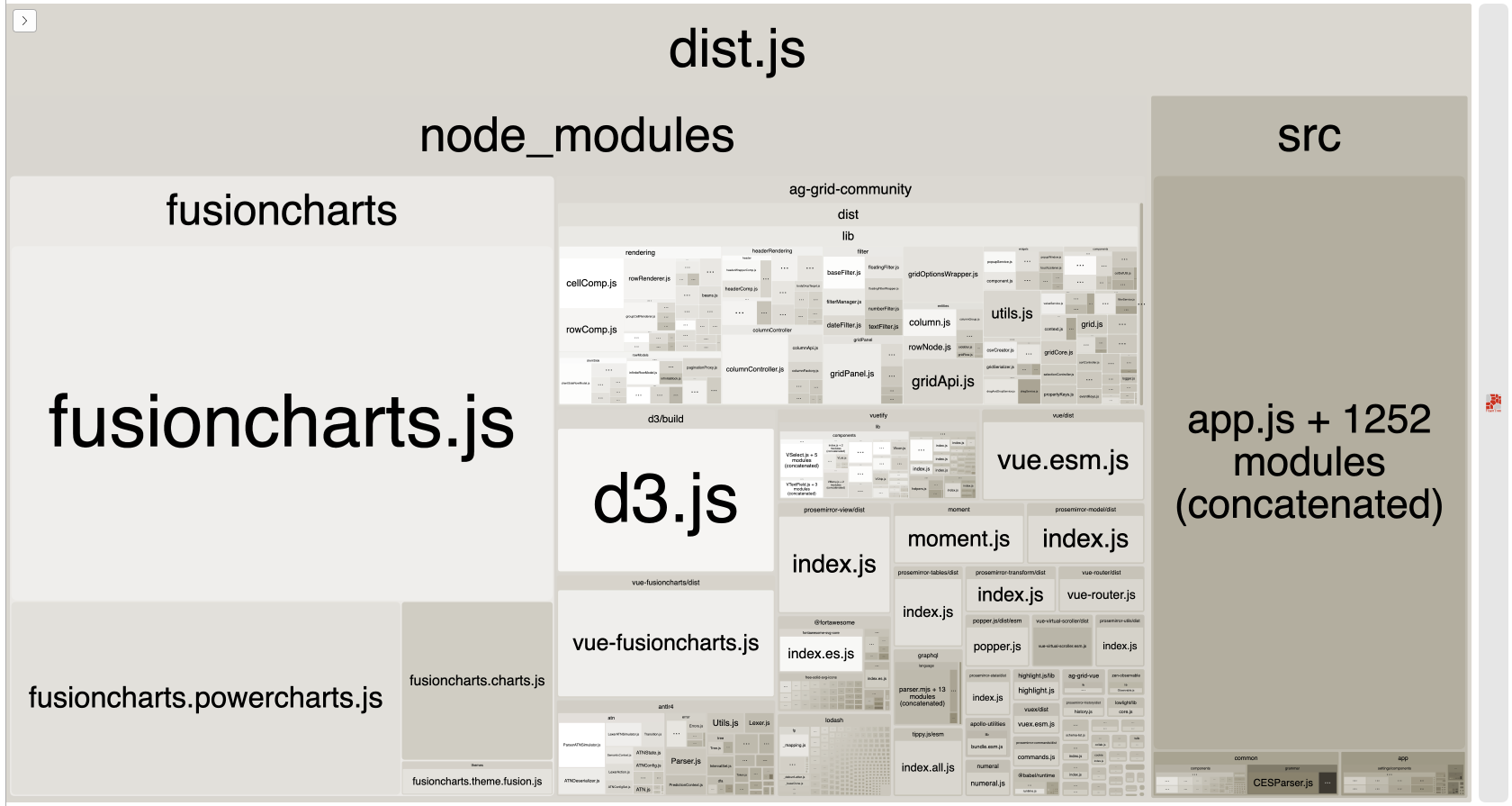
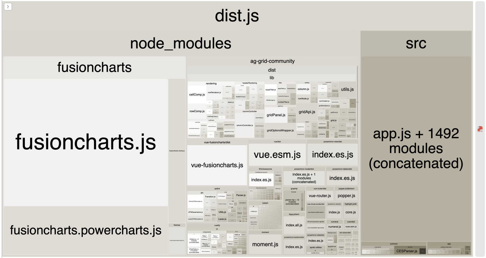
The overall bundle size before doing this was 1.37MB. After following the Webpack tree shaking guidelines, the resulting bundle size was then 1.33MB. This equates to a roughly 3% reduction in bundle size!
Node.js Version Upgrade
With the bundle size reduced, the next task in improving performance was to upgrade the version of Node.js used to build the web app.
The team was using the maintenance LTS version of Node.js, which at the time was Node v10. My task was to upgrade from Node v10 to the active LTS version, or Node v12.
This task also involved running the npm command npm outdated to determine if
any key dependencies were out of date and needed updating.
Similar to the tree shaking task, we profiled the app build time before making
any changes to get a baseline. I then upgraded to Node v12 with the help of
nvm, updated several key Babel and Webpack dependencies, then finally profiled
the build time once more. With the aforementioned changes, we saw a build time
improvement of roughly 12% or almost an entire minute drop in the time needed to
build the app.
Metrics Charts Refactoring
The web app bundling and performance optimizations involved a good amount of hand-holding since it was the first couple weeks into my internship. This next task, however, was my first real chance to show what I was capable of.
In Express, there is a page dedicated to displaying graphs of metrics from the integrations I talked about previously. These graphs show a mix of real-time and delayed data and enable users to view ingested metrics and anomalies of interest.
Up to this point, the UI team had rolled their graphs and charts using D3, the popular data visualization library I mentioned earlier. D3 is incredibly versatile and unopinionated which means there are countless possibilities for what can be done with it.
Those same benefits, however, mean that doing something as specific as plotting data can require much more work and maintenance than just using a dedicated charting library. Thus the need to replace the custom D3 metrics graphs with the library product chose: FusionCharts.
FusionCharts is, by nature, very different than D3. Its sole focus is graphs and charts, so things that had to be custom built in D3 such as data ranges, event highlighting, and data tooltips are all just built-in with FusionCharts.
Of this Metrics Charts Refactoring epic, I was given two charts to update: rollup and boxplot.
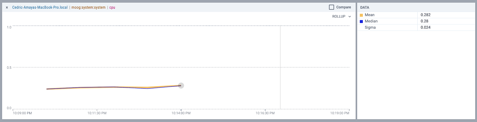
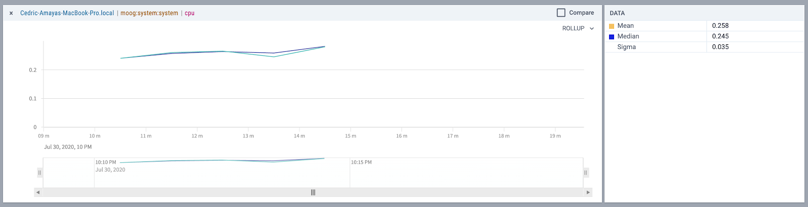
Rollup
The rollup chart is simple multiple series time-based graph whose data is grouped by a given granularity, one of: minute, hour, day, month, etc. In Express, the rollup chart displays the mean and median values for a given metric and is displayed when the time frame exceeds six hours. For example, say I was looking at the CPU metric graph for one of my servers for the past week. The rollup chart would graph seven points (one for each day) since the granularity would equal "day."
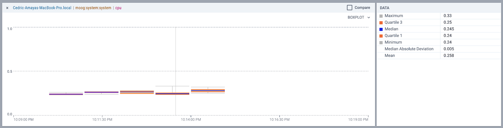
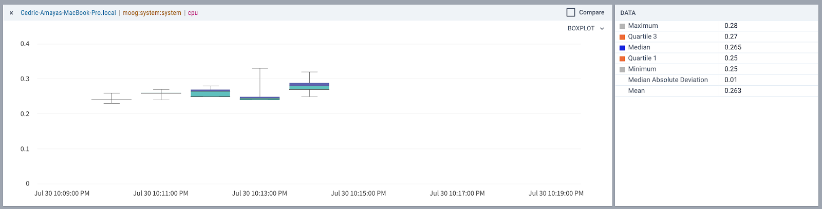
Boxplot
The boxplot chart uses the same data returned by the backend as the rollup chart, however, it's used to display the five-number summary of the given metric and given granularity. The five-number summary consists of the most extreme values for the given period, the lower (first) and upper (third) quartiles, and the median. This type of visualization is helpful at giving IT operators an idea for the spread of the metric data, as well as determining whether or not any data points are outliers.
FusionCharts Challenges
Refactoring these charts from D3 to FusionCharts did not come without any challenges.
My biggest gripe with using FusionCharts was having to deal with their poorly-documented API. Many of their charting components are highly customizable, however, some of the features would not be documented anywhere which made consuming their library feel like shooting in the dark at times.
The other challenge with refactoring these graphs using FusionCharts was trying to meet complete parity with the custom-built D3 charts. Some custom visualizations on the D3 charts had to be dropped from the spec simply because FusionCharts did not offer any API to handle data as had been done so using D3.
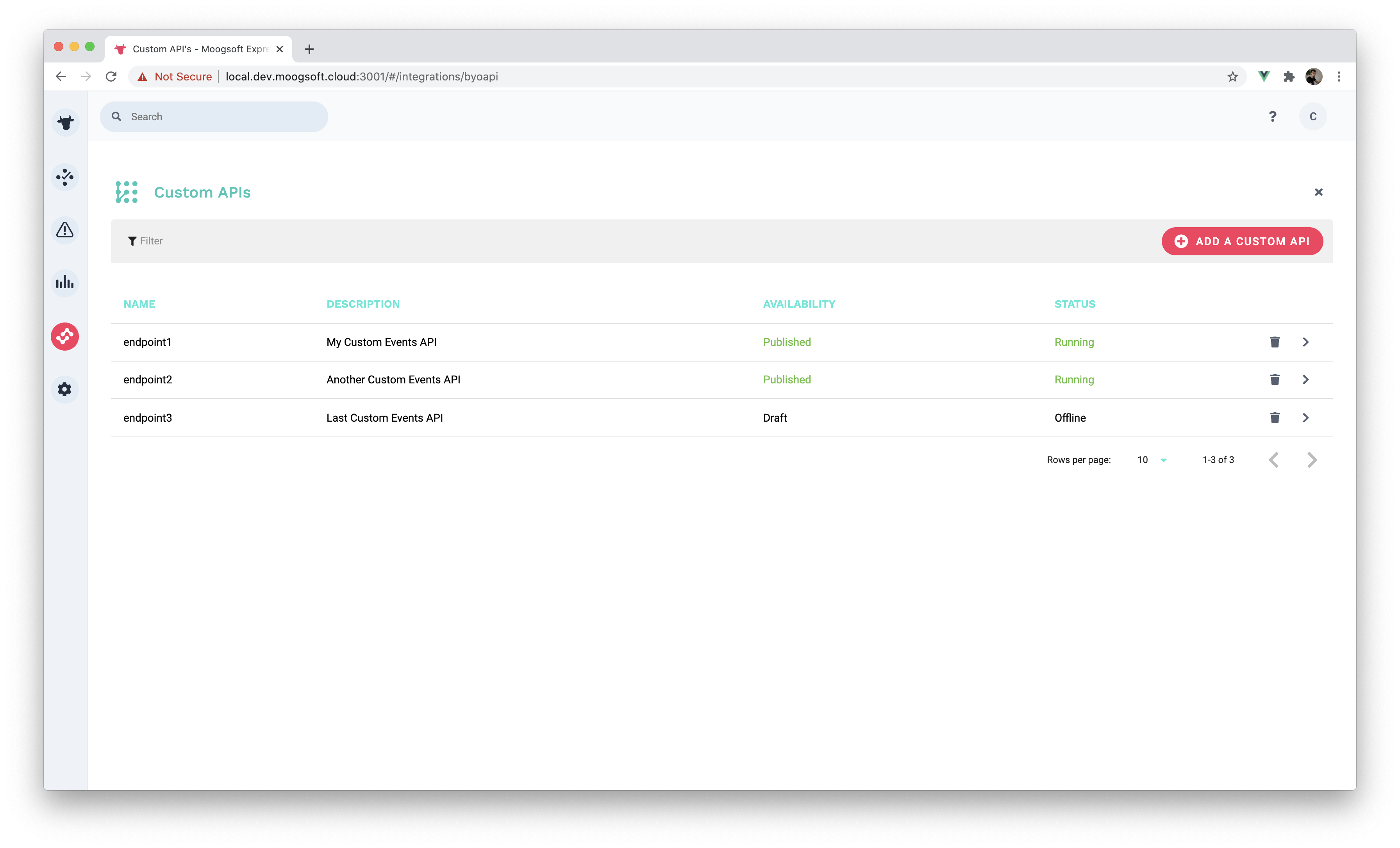
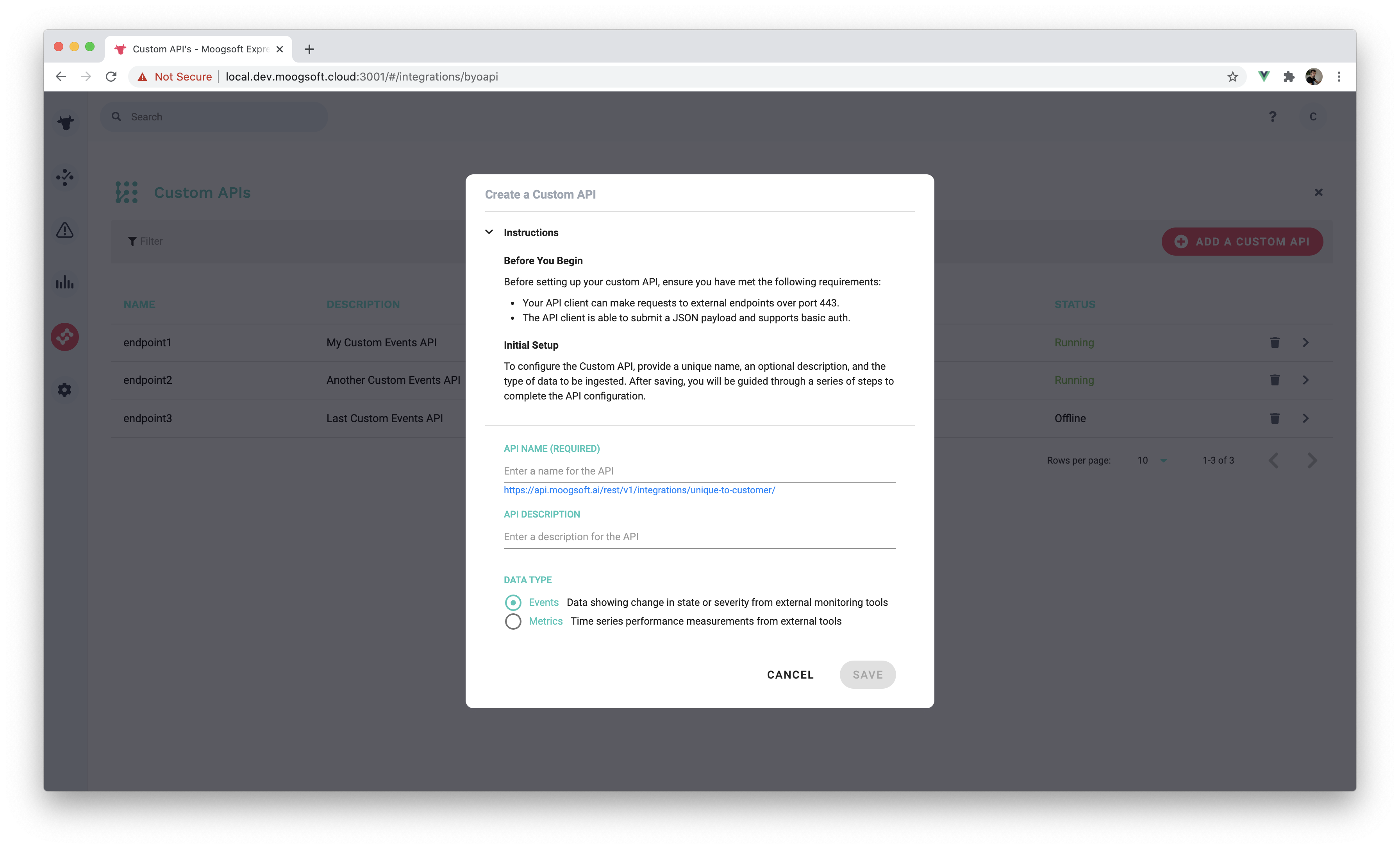
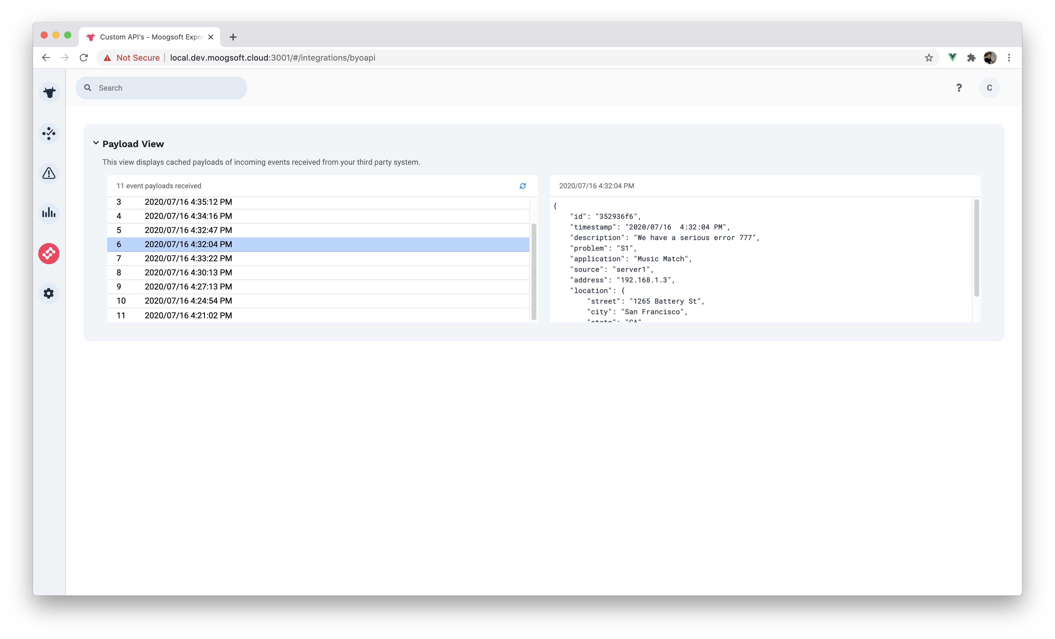
BYOAPI Integration Components
After wrangling JavaScript charting libraries for several weeks, I finally got the chance to write my own Vue.js components for a new Express integration. This integration, internally named BYOAPI or "bring your own API," would allow customers to connect their own APIs to Express so that Express could then ingest their endpoint payloads and correlate the data as specified during the setup process.
As part of this epic, I worked on several different components related to BYOAPI. This gave me the opportunity to use Vue's Composition API (a function-based approach towards component composition, similar to React Hooks) as well as a cool Vue feature called slots.
For each of these components I utilized the popular Vue Material UI library, Vuetify, and built the components as specified in the InVision mockups given to me by design. Below are a a handful of the components I was tasked with building:
Key Lessons & Takeaways
After spending ten weeks helping to develop Moogsoft Express, there were some key lessons and takeaways I got out of working as a software engineer for a tech company.
Lessons
Benefit of requirement gathering, especially before writing any code. As developers, we are often very eager to jump straight into programming when given a new feature to complete. The problem with this is we often do not have all the necessary requirements or the ticket for the feature is empty except for a title, so what exactly needs to be done? Oftentimes we will just do what we think is best, but that can bite us in the butt if designs change or the feature itself is axed. That's why it is important to find out as much as possible before doing any coding so as to save time.
Importance of asking for help. As an intern, it is not expected that you know everything and any team will expect you to ask questions and ask for guidance. What's great about asking for help is that it's a win-win situation for both you and the person you ask for help from: you get your question answered and you can continue working, and the helper feels good being able to help you out.
Power of testing. In school and with my own side projects, I rarely tested my code outside of manual end-to-end testing. I think there are many benefits of testing, but the most impactful benefit I found was when refactoring code: The tests themselves act as a guide, pointing you in the direction of what still needs to be fixed. The process of breaking something, fixing it, then repeating that process gave me the confidence that the task was finally complete and good to go once all the original tests were green.
Takeaways
Separation of concerns. As the newest member of the team, it can sometimes be hard to get up to speed and contributing when you don't understand the codebase. I found that a well-structured project whose components (not necessarily UI components) are separated by their domains made it much easier to piece together how the app works mentally.
Feature flags are cool. Feature flags were not something I was taught in school but I found the concept very interesting—the ability to enable/disable certain features on a per-customer basis can be useful for both B2B and B2C businesses. Seeing how easy these were to configure gave me some cool ideas for premium features for my side project, Unearth.
Vue might just be better than React. Personal opinion of course, but I found creating components using Vue easier and more intuitive compared to React. What I liked most about Vue was the concept of single file components, where the markup (HTML), styling (CSS), and scripting (JavaScript) are all defined in one file per component.